Sembikiya dévoile un nouveau logo de marque dans le but de devenir le magasin de fruits le plus populaire au monde.
2021.07.21
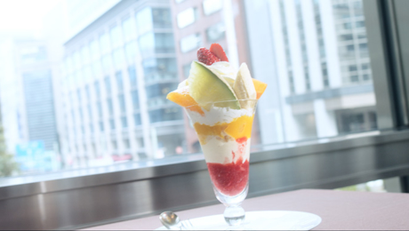
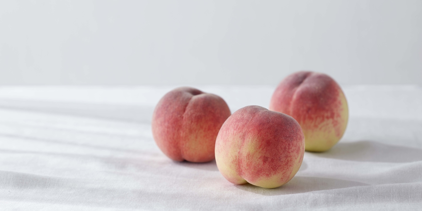
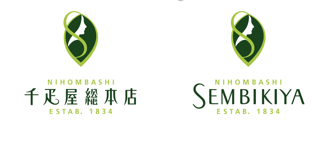
FOODNihonbashi Sembikiya-Sohonten has been bringing delicious fruits to its customers ever since it was founded in 1834. Its symbol mark has continued to evolve along with the brand itself. When its fifth-generation owner built the shop’s main building in 1971, a symbol mark modeled on the fruit parlor & fruit restaurant “DE’METER” that had opened in the building was unveiled. The colorful design of this symbol mark was inspired by the Greek and Roman goddess of the harvest, Demeter, and it was widely featured on its wrapping paper and shopping bags.
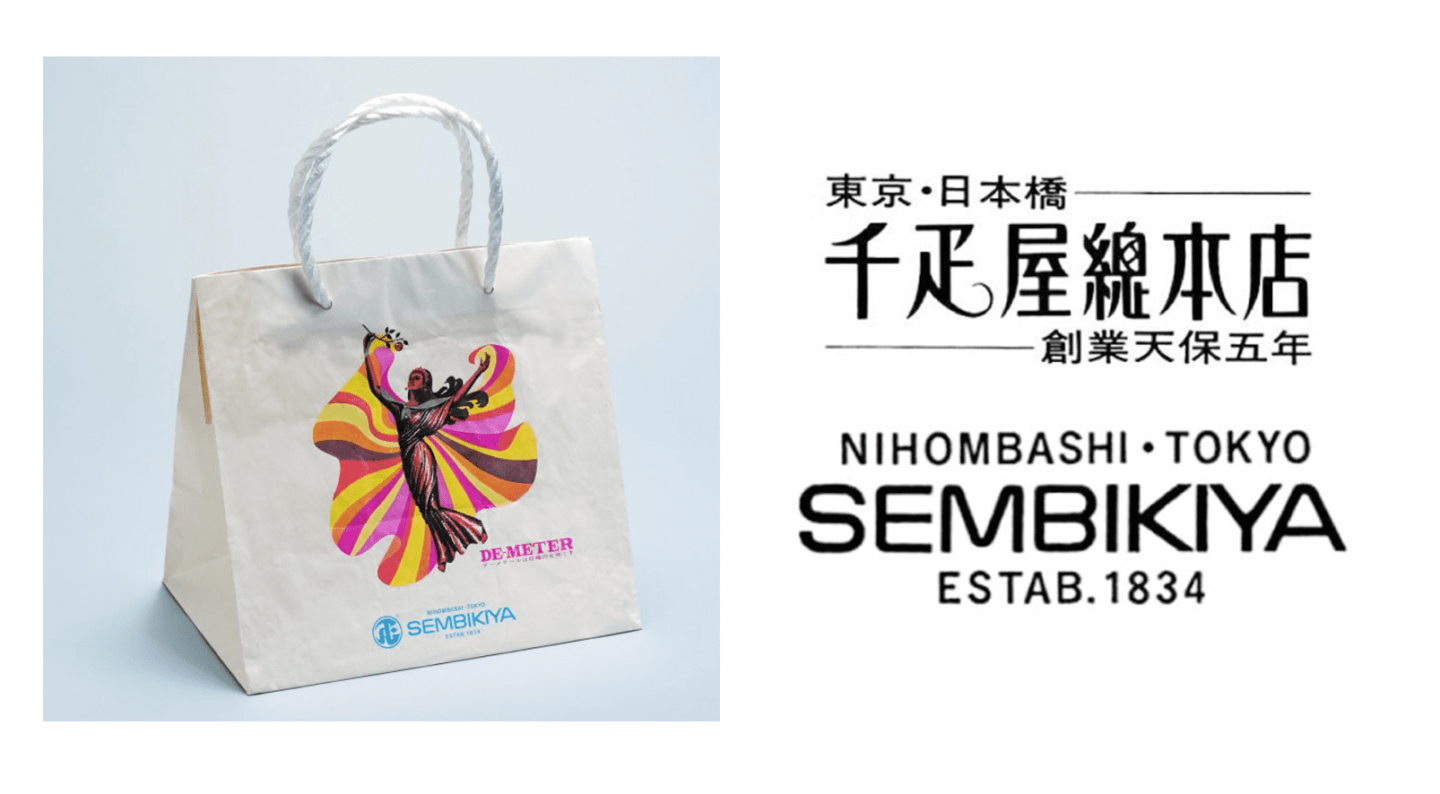
Thirty years later, the sixth-generation owner of the company launched a “Brand Revitalization Project” in 2001 to transform the store into one that is more attuned to the times instead of falling back on its long-established reputation. The brand’s symbol mark was also redesigned as part of this project. The new symbol mark retained the motif of Demeter even as it was refined into something more elegant. The first letter of Sembikiya, “S,” was combined with the profile of Demeter to create the shape of a leaf, which symbolizes all fruits. The typography of the symbol mark was also revamped to evoke a fresher and more modern feel. This project helped Sembikiya to create a lasting impression for its new worldview.
After another twenty years have passed, Sembikiya’s symbol mark was redesigned again in April 2021 to reflect the changing times. While the goddess of the harvest, Demeter, kept her place in the latest symbol mark, graceful lines were added to convey the mellow flavors of Japan’s delicious fruits, with the shapes and colors of the symbol mark creating a simpler and stronger impression. The tagline above and below the store name has also been changed from “NIHOMBASHI ESTAB. 1834” to “NIHOMBASHI TOKYO.” This underscores the company’s vision to become an iconic fruit shop brand of Tokyo that is loved not only by the people of Japan but also by others around the world. As Sembikiya approaches its 200th anniversary, this long-established brand continues to evolve so that it can bring Japan’s amazing fruits to even more people.